In a print, what percentage of off color details will still work well?
Prints that have at least 75%-80% of the colours from your season will usually work reasonably well. A trick to make multi-seasonal coloured prints work more effectively is to pair them with other solid coloured items (such as scarves or jewellery) that are in the right colors to offset the effects any of the colors in the print that may be less effective for your colouring.
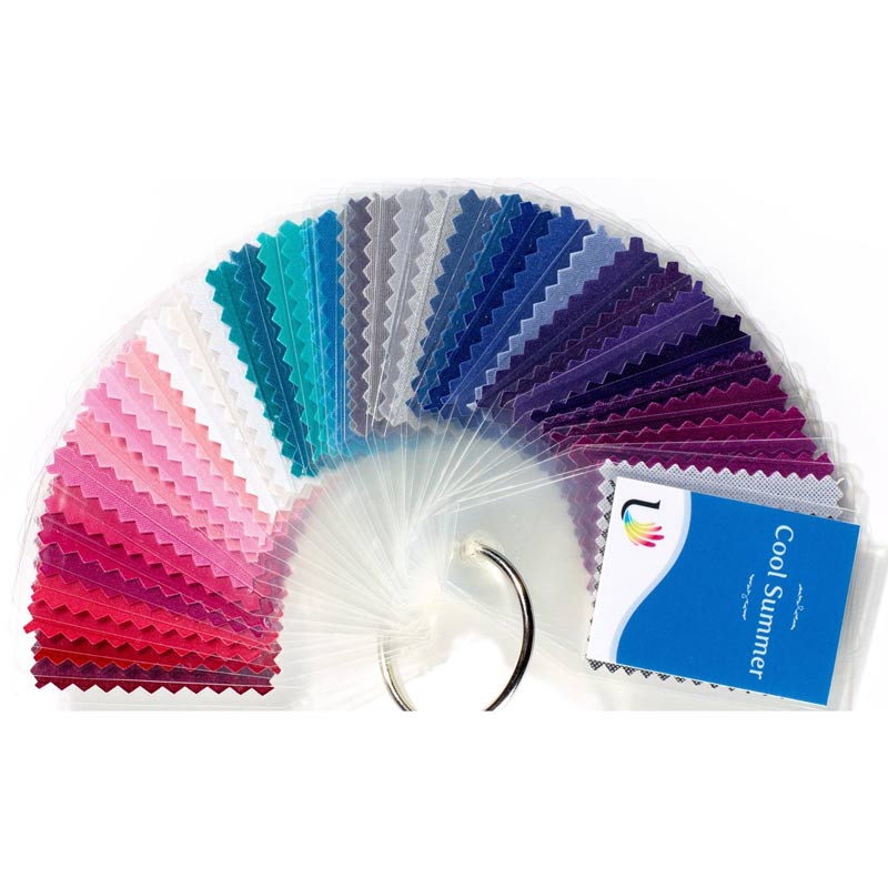
How can I be sure I’m really a Soft Summer?
The best way to determine season is to do a comparison of all seasonal options in a colour analysis, however, if this not an option the following points may make it easier to see if this is an option for you.
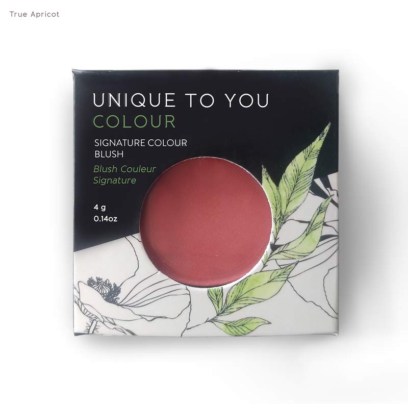
For Soft Summers mutedness of colour is absolutely essential (if you can wear brights (or are undecided on what degree of colour clarity is best for you), it’s more likely than not that you may be another season. Softness of colour is key for this season and tends to be a great starting point in figuring out if this is the right palette for you.
Most Soft Summers have ash brown or neutral chestnut brown hair that ranges in depth from light to medium brown. The skintone of a Soft Summer usually tends to be in the light-medium range (when not tanned) and often has a matte and opaque quality to it. Having skin that is very fair or very translucent is uncommon in this season and usually makes another season more likely.

I’ve noticed that certain colours create both positive and negative effects on my skin at the same time? How do I know if these colors are right for me or not?
The short answer to this question is that any colour that produces any adverse colour effect on your skin (whether it be shadowing, discoloration, or loss of colour) is not 100% optimal for you and is probably not in your season. The reason that colours can produce both positive and negative effects on the skin simultaneously is due to the fact that there are certain scenarios where a color can connect with someone’s coloring on one dimension (such as clarity for example) but not another anther (undertone).
Where can I go to locate a professional color consultant in my area?
You can locate professionally trained colour consultants on the Association of Image Consultant International website: https://www.aici.org/ (On the Home page, select “Locate and Image Consultant”, select “Color Consultant” in the “Specialty dro”p down menu, and enter your location and you should be able to find a list of color consultant in your region.)
You can also check out the Colour Consultant Directory on the Direct Colour International website here: https://www.styleandimage.co.uk/consultant_map
I would love some recommendations about finding your way when you look atypical for your season (after professional PCA). Thanks
In general, your physical attributes (or whether you look “typical” or not for a given season), should not really play a very significant role in how you work with your season and the seasonal palette should well for you overall without too many adaptations being necessary to make the colours work. However, there are certain cases where taking clues from your colouring might be helpful. For example, taking into account your personal contrast level can often be helpful as a guideline in combining colours of different values (degrees of depth) together in a single outfit.